Analysing #SONA2020
24 Feb 2020Two weeks ago the most important governmental address of the year was made in front of millions of South Africans as the president laid out the state of the nation and discussed the plans for the country in the years ahead.
In true South African fashion we sat at home and discussed the event over social media. We complained and laughed as the event started off with a long disruption that seemed more like a circus performance than a joint sitting of parliament, and then delved deep into some serious debate as the president made his speech.
However - it is 2020, and thus all these conversations were made over social media (especially Twitter). Thanks to this, we were able to do some brief but insightful analysis into the feelings and attitude of the public regarding the state of the nation address.
Overview
Our approach to this was to simply gather all the tweets relating to SONA. In total we gathered about 45 thousand tweets over 5 hours.
If you’d rather quickly get the important points of this post rather than reading the wall of text below, here they are:
- In general people were fairly positive about the state of the nation.
- People much rather discussed the disruptions preceding the speech, and this discussion was decidedly negative.
- The best-received topics from the speech were coding (and robotics), cannabis and education.
- Topics such as crime and unemployment were negatively received.
- Surprisingly, discussion about loadshedding and electricity was neutral overall.
If you’d like to read the results in more detail, read on! Feel free to skip to the end of the post if you’re only interested in how we gathered this data and turned it into information.
Analysis
Be warned - many graphs lie ahead.
Also, a quick rundown of the timeline of the event:
- The event started at 7pm, but immediately devolved into disruptions and arguing.
- These disruptions continued until about 8:30, when the EFF left the venue.
- Various parties voiced their complaints about the disruptions for the next 15 minutes until about 8:45.
- The actual SONA speech was made from about 8:45 to 10:10.
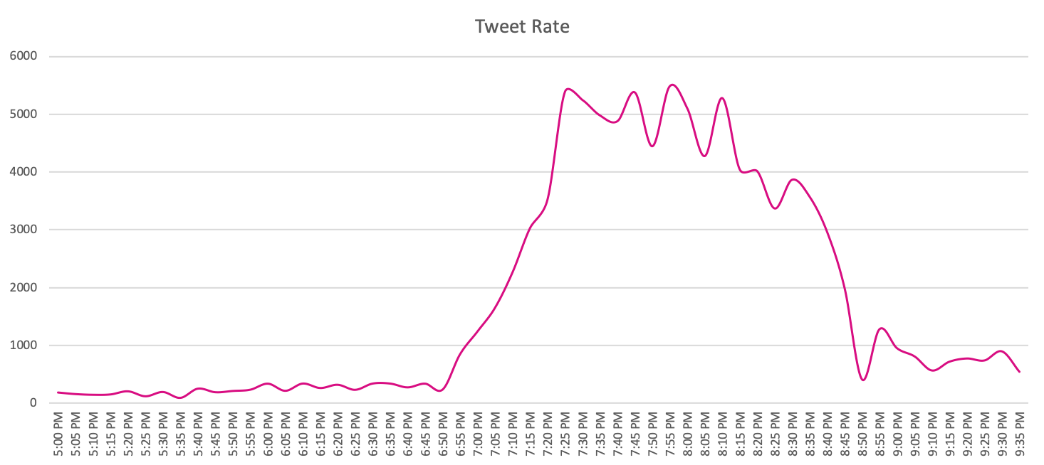
The first interesting information that we were able to gather was the amount of tweets made. We calculated the rate of tweets as the amount of tweets made every five minutes, resulting in the following graph:

We can quickly see the following:
- There was a lot of tweeting. We peaked at about 1000 tweets per minute, or 16 tweets a second.
- During the disruptions the rate of tweeting was far higher than during the official speech (by a factor of about 5x!).
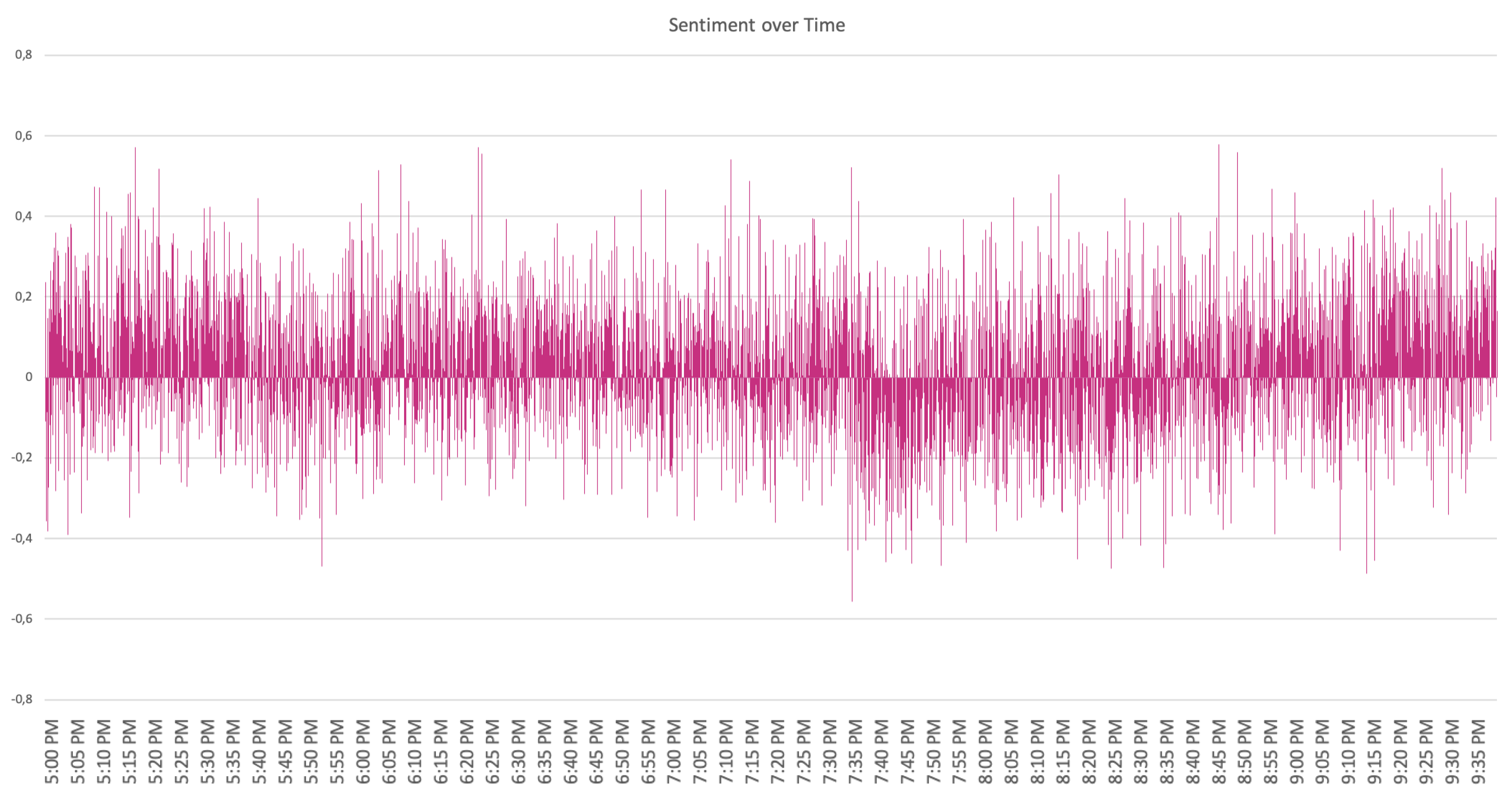
We then calculated the sentiment for every tweet. This sentiment score gauges the general attitude or feeling of the tweet, and is a number between -1 and 1. A sentiment of 1 is quite positive, and -1 quite negative. The average sentiment of all the tweets gathered was a decently positive 0.139.
Graphing these sentiments results in a very noisy and overall quite useless graph:

We can almost distinguish some trends at about the 7pm and 8:30 timeslots, but it’s not very clear. Splitting the data into 5-minute intervals and graphing the average sentiment per interval gives a much clearer idea of the trends in sentiment:

Referencing the helpful overlay of the timeline, we can see that there is a definite correlation here. As the disruption continues the average sentiment declines noticeably. This turns around when the disruption ends, indicating a that the discussion has turned more positive. There are still sharp spikes in negative sentiment during the address - these may indicate areas in the speech that were taken particularly badly.
We then categorized the tweets based on a very simple keyword-based classification. For the categories we chose a variety of trending topics that were discussed in the tweets, as well as some key points of the SONA address.
Categories based on trending topics:
- The EFF.
- The removal of De Klerk from the event.
- The firing of Pravin Gordhan.
- The ‘Perfect Wedding’ remark made during the event.
Categories based on key points in the speech:
- Electricity and loadshedding
- The introduction of coding and robotics in school.
- The expansion of the hemp and cannabis industries.
- Crime and policing.
- Students, student housing and education.
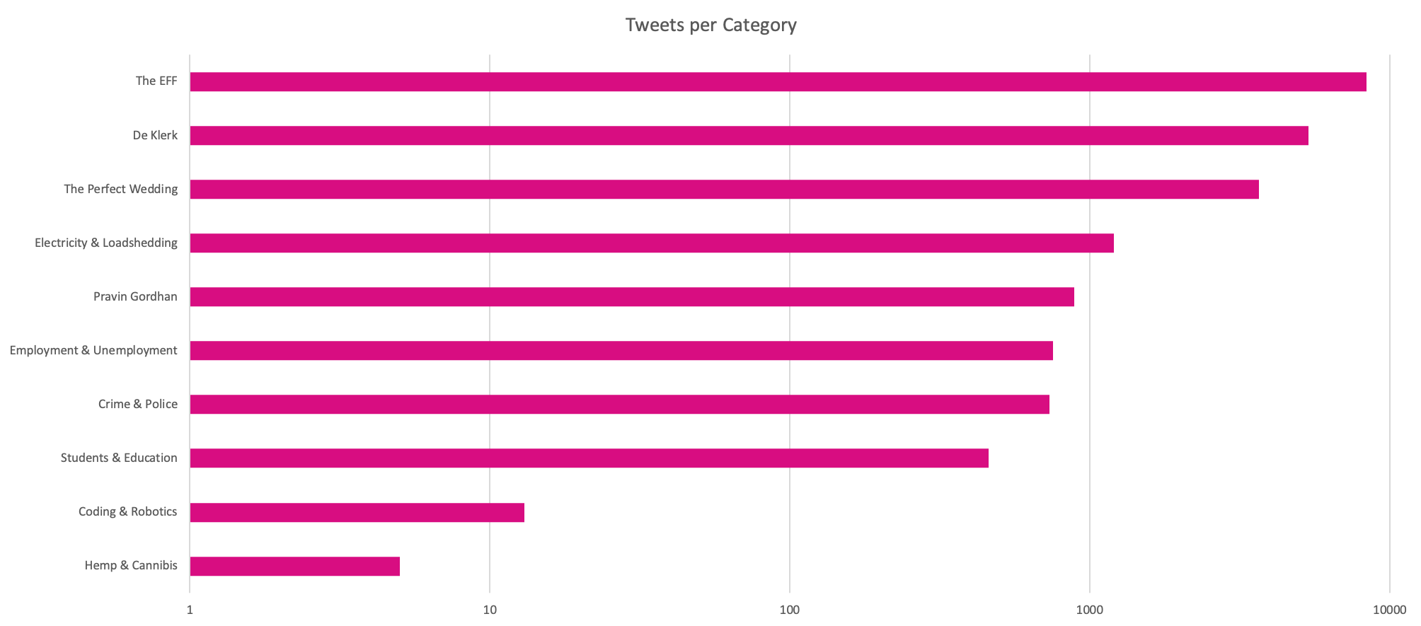
Graphing the number of tweets in each category gives a rough idea of how much each topic was discussed:

Notes:
- Tweets can be in multiple classes.
- The scale of the graph is logarithmic, due to the large difference in scale between topics.
It’s clear here that the conversation was dominated by discussion of the EFF, De Klerk and loadshedding, corroborating our findings above with regards to the rate of tweets at certain times.
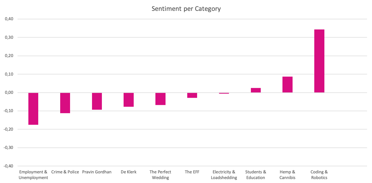
Taking this to the next logical step, we then calculated the average sentiment per category:

This shows some unsurprising information:
- The discussion of the disruption at the beginning of the event was decidedly negative.
- Topics such as hemp, coding and education were positively received.
- Topics such as crime and unemployment were negatively received.
- Surprisingly, loadshedding is pretty neutral despite the vast amount of tweets relating to loadshedding and electricity.
Method
Our method for doing this was twofold:
- We used the Twitter API to stream the Twitter posts as they were made. We ran this from 5pm to 12pm (five hours), filtering on tweets including either the #SONA or #SONA2020 hashtags.
- We used sentiment analysis to gauge the attitude or feeling of the tweet. We calculated sentiment as a number between -1 and 1; 1 being very positive and -1 being very negative.
Conclusion
Sentiment analysis and social listening as demonstrated here can be very useful tools in determining public opinion, and can be used when making critical business decisions about product and service offerings. We plan to do something similar for this weeks budget speech, so stay tuned for that!


